
Gift box design trends 2026: what to spec now
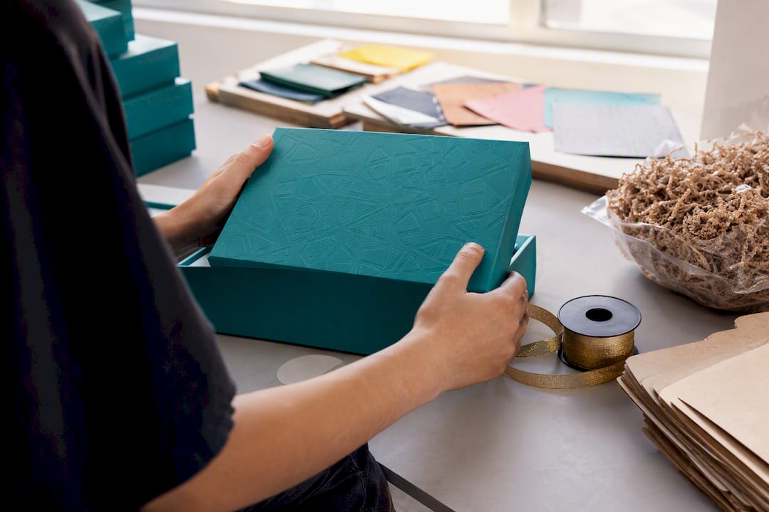
Eight forces are reshaping gift box design for 2026: PPWR-driven sustainability, material-led minimalism, tactile finishes, structural unboxing moments, recyclable interior inserts, digital layers, hyper-personalisation and accessibility. Together they mark the moment gifting packaging stops being an afterthought and becomes a genuine brand touchpoint.
Two forces make 2026 different from previous years. The EU’s Packaging and Packaging Waste Regulation lands with recyclability and PFAS-free requirements that reshape supplier briefs, and 3D virtual sampling plus variable-data printing have matured enough to make small-batch, personalised runs commercially realistic rather than a luxury add-on. At Sayheygifting, we specify these details daily for employee and corporate gift boxes, and this guide, shaped by our own briefing process, sets out what to prioritise.
The headline shifts for designers and brand managers to plan around:
Sustainability and compliance: recyclable, PFAS-free materials become the default, not the premium option.
Material-led minimalism: soft-touch matte, blind debossing and restrained foil replace busy branding.
Tactile finishes: velvet coatings, spot UV and foil accents signal quality before the box even opens.
Structural unboxing: magnetic closures, drawer boxes and collapsible formats build the reveal into the design.
Interior inserts: moulded pulp and honeycomb paper replace foam almost entirely.
Digital layers: QR, NFC and AR add a second layer of storytelling.
Hyper-personalisation: variable-data printing makes name-level customisation viable at scale.
Accessibility: easy-open features and legible typography widen who can enjoy a gift box unaided.
Key Takeaways
Gift box design in 2026 succeeds when sustainability compliance, tactile restraint and structural planning are decided together at the brief stage, not bolted on after a design is finalised.
Point | Details |
Lead with PPWR compliance | Request FSC certification and PFAS-free coatings in writing before approving any supplier. |
Choose structure before finish | Decide magnetic, collapsible, drawer or folding carton first, since it shapes every later spec. |
Pick one signature finish | A single blind deboss or foil accent scales better across a range than multiple competing techniques. |
Replace foam with pulp or card | Match moulded pulp, rigid die-cut card or honeycomb paper to the fragility and category of the product. |
Use 3D samples to cut costs | Virtual previews shorten modification cycles by roughly 70% before committing to physical proofs. |
Table of Contents
Sustainability and compliance: specifying recyclable, PFAS-free gift boxes
The EU Packaging and Packaging Waste Regulation requires packaging placed on EU markets to be recyclable and free from PFAS coatings. For designers briefing suppliers this year, that is not a distant compliance date to file away. It is a live spec requirement that touches board choice, lamination, ink and closure hardware all at once.
The upside is that early compliance reads as quality rather than bureaucracy. Brands that display FSC certification or a PFAS-free declaration on the box itself convert a legal obligation into a trust signal that customers notice on unboxing. A recipient who sees a recyclability mark alongside a beautifully finished box reads care into the whole experience, not just the outer layer.
Building a compliant spec sheet means asking your supplier for evidence, not assurances. A practical checklist to attach to any purchase order:
FSC-certified or PEFC-certified board stock, with chain-of-custody documentation available on request.
Water-based soft-touch coatings rather than solvent-based laminates.
PFAS-free varnishes and adhesives, confirmed in writing by the supplier.
Recyclable interior inserts, avoiding mixed-material foam or plastic film wherever possible.
A mono-material structure where feasible, since mixed substrates are harder to recycle even when each part is individually recyclable.
Our guide to eco-friendly gift box specification walks through how these choices apply to corporate gifting ranges, where volume makes material decisions matter even more.
Pro Tip: Ask your supplier for a PFAS-free lamination certificate before the first sample run, not after. Retrofitting a compliant coating onto an approved design almost always changes the tactile finish, which means resampling the whole box.
Material-led minimalism and the rise of quiet luxury
Quiet luxury has become the dominant aesthetic for premium gift boxes heading into 2026, and it works because restraint now reads as confidence rather than lack of effort. Soft-touch matte bases, blind debossing and a single restrained foil accent have replaced the logo-heavy, colour-saturated boxes that dominated gifting five years ago.
Soft-touch matte has moved from differentiator to baseline expectation. Design consultancies now treat matte coating as the industry standard for premium gifting, which means a glossy laminate on a corporate gift box can now read as dated rather than bold. Blind debossing (pressing a design into the board without ink or foil) delivers texture and brand presence without adding a single visible colour.
Colour palettes have followed the same logic toward restraint. Muted, earthy tones (think dusty terracotta, sage, oat and warm greys) dominate over primary colour branding, partly because they photograph better under the soft, diffused lighting most unboxing content and social sharing relies on. A box that looks premium under a ring light sells itself twice: once at purchase, once on a recipient’s Instagram Story.
The practical challenge is scaling one signature element across an entire product range without it disappearing into sameness. A single tactile signature, such as a consistent blind deboss position or one warm gold foil detail, tends to carry more brand recognition than three competing finishes fighting for attention on the same lid. Pick one mark and repeat it everywhere.
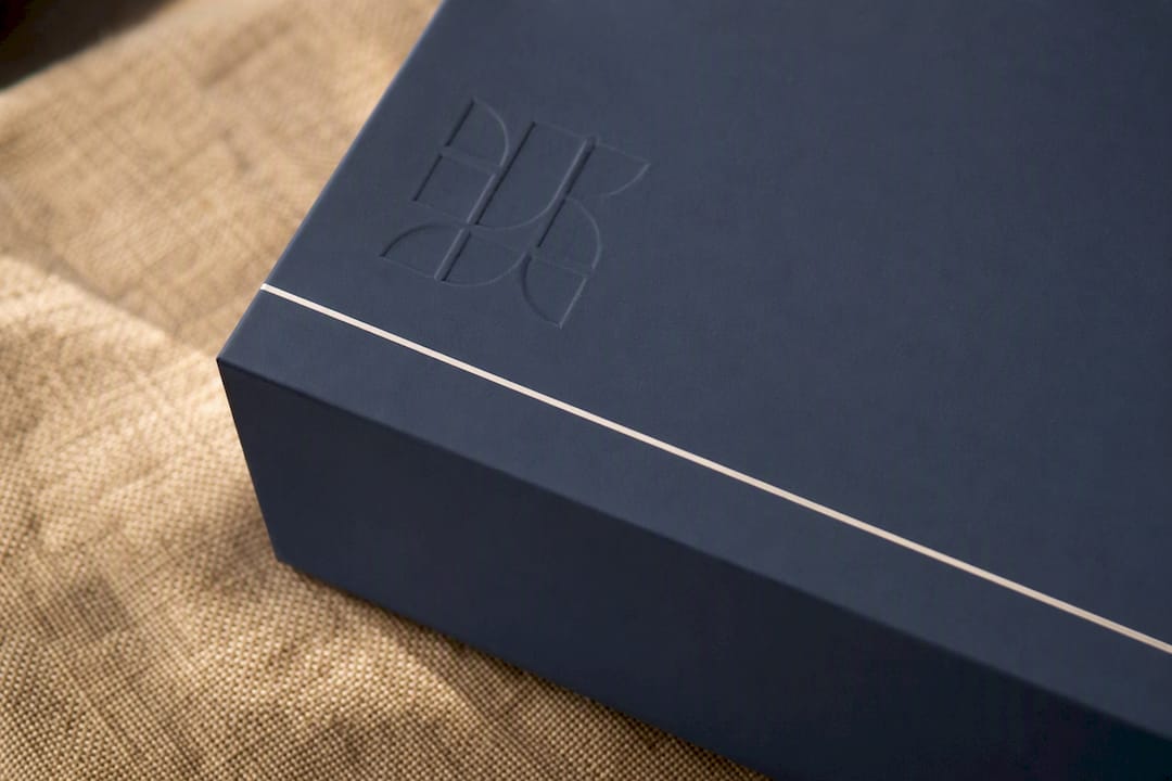
For inspiration on applying restraint without losing distinctiveness, our round-up of creative gift packaging examples shows how brands keep a recognisable signature across very different box formats.
Tactile finishes that signal value before the lid opens
Touch is the first sense a recipient engages with a gift box, often before they read a single word on it. Choosing the right finish for the category you’re packaging matters as much as the finish itself.
Recommended pairings by category:
Beauty and skincare: soft-touch matte base with cold foil detailing on the product name; velvet lamination for high-end ranges where the box doubles as a keepsake.
Corporate gifting and employee boxes: linen-textured stock for a tactile but professional feel, paired with blind debossing of the company or campaign name.
Tech and homeware: spot UV on structural lines or icons against a matte base, which reads as precise and modern rather than decorative.
Cold foil and hot foil solve different problems. Hot foil stamping presses metallic foil into the board using a heated die, producing a crisp, slightly raised finish that suits small logo marks and short text. Cold foil applies adhesive first, then foil, allowing larger coverage areas and finer detail at lower unit cost on longer runs. Spot UV, a glossy varnish applied only to specific areas, works well for adding shine to a single icon or wordmark against a matte backdrop without the cost of foiling.
Velvet and linen-effect coatings add genuine sensory weight to a box, and both are worth reserving for the outer shell rather than interior inserts, where the cost-to-visibility ratio drops sharply.
Pro Tip: Brief your pre-press team with a physical Pantone swatch and a labelled dieline showing exactly which panels get which finish. Verbal descriptions of “matte with a bit of shine” are the single most common cause of finish mismatches between sample and production run.
Structure and unboxing: picking the right format for the moment
Structure should be the first decision on any gift box brief, not the last. It determines the unboxing sequence, the shipping cost, and every material choice that follows, so choosing the finish before the structure is backwards.
Magnetic rigid boxes offer the most premium unboxing moment: a satisfying resistance on opening, a flat lid reveal, and enough structural strength to support debossing and heavier board stock. They cost more to produce and ship (rigid board doesn’t collapse flat), so they suit higher-value gifts where the reveal matters as much as the contents.
Collapsible magnetic boxes deliver almost the same closure experience but fold flat for storage and freight, cutting shipping volume significantly. They’re the practical middle ground for brands sending gifts at volume, such as employee appreciation boxes shipped to dozens of addresses at once.
Drawer boxes create a two-stage reveal: an outer sleeve slides away before the drawer itself opens, adding a deliberate pause to the unboxing sequence. They photograph exceptionally well for social content but need slightly more careful tolerancing so the drawer glides rather than sticks.
Folding cartons remain the most cost-effective and freight-efficient option, and modern finishing (soft-touch lamination, blind deboss) means they no longer look budget by default. They suit high-volume corporate runs where per-unit cost needs to stay controlled.
Whichever structure you choose, consider adding a ribbon pull or interior tab that lifts the product for the recipient, since a two-stage reveal (outer box, then a lifted interior) consistently reads as more considered than a single flat opening. On magnet strength, specify at least 380 gauss for a rigid lid that won’t creep open in transit, and always request a drop-test result from your supplier before committing to a large production run.
Interior presentation: moving beyond foam
Foam inserts are disappearing from premium gift boxes, and the replacement materials moulded pulp, rigid die-cut card and honeycomb paper each solve the protection problem differently.
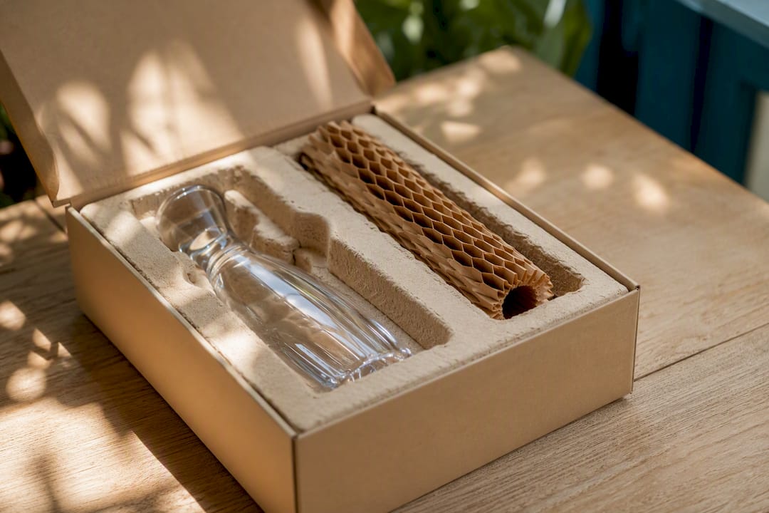
Moulded pulp, formed from recycled paper fibre pressed into a mould, offers genuine cushioning for fragile items and can now be specified in natural, bleached or dyed finishes rather than left as raw grey fibre. That shift matters because it means pulp inserts no longer need hiding under tissue paper. They can be the visible design feature.
Rigid die-cut card suits products with a defined shape, such as cosmetics sets or small tech accessories, where a precisely cut cavity holds each item in place without any cushioning material at all. It’s the lightest option by weight, which helps on postal and freight costs.
Honeycomb paper, a lightweight structural material with a cellular core, works well as a divider or riser inside a box rather than a full moulded cavity. It adds structural support with minimal material, useful for subscription-style boxes where multiple smaller items need separating without bulk.
Match the insert to the category:
Fragile luxury items (glassware, ceramics, skincare bottles): moulded pulp for genuine drop protection.
Corporate gift kits (notebooks, mugs, small tech): rigid die-cut card for a clean, tailored fit.
Subscription-style or multi-item gifts: honeycomb paper dividers to separate items without adding weight.
Our examples of sustainable corporate gifts show several of these insert choices in production use.
Pro Tip: Always request a physical die-line proof with the actual product inside before approving a pulp or card insert for mass production. A digital render can look perfect and still be 2mm too tight once the real item sits inside it.
Personalisation at scale without production headaches
Variable-data printing lets a single production run output a different name, message or code on every box without stopping the press between units. This makes name-level personalisation commercially viable at real volume rather than something reserved for hand-finished, small runs.
Common applications include printing a recipient’s first name on the lid, a personalised message inside the flap, or a unique code linking to a digital experience (more on that below). For corporate gifting, this typically means a spreadsheet of employee names feeding directly into the print file for each box in a batch order.
Getting the artwork template right avoids the most common failures:
Build a template with a clearly marked “safe zone” for variable text, kept well away from fold lines and die-cut edges to prevent cropping.
Choose a single font family with good character coverage (accented letters, apostrophes in names like O’Brien) tested across the full name list before production.
Keep variable text in one solid colour rather than a gradient or foil effect, since foiling can’t easily vary per unit on a standard press run.
Proof a sample batch of at least 20 names, including the longest and shortest in your list, to catch overflow issues early.
If you’re handling recipient names and personal messages, treat that list as personal data under UK GDPR. Limit access to the file, agree data retention terms with your print supplier in writing, and delete the working file once the run is complete rather than leaving it on a shared drive indefinitely.
Digital unboxing layers: QR, NFC and beyond
Digital layers add a second act to the physical unboxing, and they scale from near-free to genuinely premium depending on budget. Design communities tracking 2026 packaging trends point to AR overlays and interactive layers as one of the clearest directions in gift box design this year.
A tiered approach works well for most brand managers planning a budget:
QR-triggered content (video message, AR filter, or a thank-you page) costs almost nothing beyond the code itself and works from any smartphone camera.
NFC tap experiences embed a small chip in the box that triggers content on a simple tap, no scanning or typing required. This suits premium gift ranges where a smoother interaction justifies the added unit cost.
Blockchain-backed authenticity or digital collectibles sit at the top end, useful for limited-edition or high-value gifts where proving authenticity or offering a genuine digital keepsake adds real value rather than novelty.
The most measurable use cases tend to be practical rather than gimmicky: a QR code linking to a product tutorial, an authenticity check for a limited run, or a social-sharing incentive that rewards a recipient for posting their unboxing. Track scan rate, time-on-page after scanning, and any follow-through action (a discount code redeemed, a review left) rather than just total scans, since scan volume alone tells you little about whether the layer actually added value. A/B test two versions of the same box, one with a QR prompt printed on the lid and one without, across a comparable batch to see whether it changes engagement before rolling it out across an entire range.
Faster sampling: 3D previews and AI-assisted concepting
Sampling used to be the slowest part of any gift box project: physical proofs, courier delays, and a full print run committed before you’d actually held the finished piece. That has changed substantially.
3D virtual samples now let designers and brand managers approve colour, finish and structure on screen before a single physical proof is cut. This shortens modification cycles by roughly 70% and lowers sampling costs by around half compared with a traditional physical-proof-only workflow, because revisions happen in software rather than in a new print run.
Small-batch digital production has become genuinely viable for runs starting around 100 units, thanks to digital printing presses and intelligent die-cutting that don’t require the large plate-based minimums of traditional litho printing. This matters most for brands testing a new gift range or running limited seasonal editions without committing to thousands of units.
AI-assisted design tools can generate concept directions, mood boards and colour variations quickly, which is genuinely useful at the ideation stage when you need six options to react to rather than one. The catch is that every AI-generated concept still needs a human check against your die-line, your material supplier’s actual capabilities, and your brand guidelines, since generated concepts frequently suggest finishes or structures that aren’t producible at the volume or budget you’re working with.
Pro Tip: Use 3D virtual samples to narrow six concepts down to two before you order any physical proof. Reserve the physical sample budget for the final decision between finalists, not for early-stage exploration.
Making gift boxes accessible without losing the aesthetic
Accessible design and quiet luxury are not in tension, and treating them as separate concerns is a mistake worth correcting in 2026. A handful of specific measures widen who can open and enjoy a gift box unaided, without diluting a restrained aesthetic:
High-contrast printing for any essential text (recipient name, opening instructions), since low-contrast grey-on-grey looks elegant but becomes unreadable for anyone with low vision.
Easy-open seams or pull-tabs that don’t require fingernails or significant grip strength, particularly useful for magnetic boxes where the closure can otherwise be stiff.
Tactile markers, such as a small raised deboss near the opening edge, that help someone locate the opening point by touch.
Optional Braille indicators on the box or an included card, particularly relevant for corporate gifting programmes that want to demonstrate genuine inclusion rather than a token gesture.
None of these require abandoning restraint. A tactile opening marker can be the same blind deboss you’re already using as a brand signature, simply positioned somewhere functional as well as decorative. Where possible, test easy-open features with people who have limited hand mobility or low vision before finalising a design, rather than assuming a feature works because it looks intuitive on a rendering.
Pro Tip: Position any tactile opening cue on the same edge every time across your product range. Consistency between products matters more than the specific tactile detail you choose.
Sayheygifting’s approach: specs we actually use
We build gift box specifications every day for corporate clients ranging from small teams sending a handful of thank-you boxes to organisations shipping hundreds of employee appreciation gifts in a single order. The trends above stop being theoretical the moment you have to write them into a real purchase order, so here’s how we translate them into working specs across three budget tiers.
Value tier: soft-touch matte folding carton, single-colour blind deboss on the lid, honeycomb paper divider inside, magnetic tab closure optional. This suits high-volume employee gifting where per-unit cost needs to stay controlled without the box looking cheap.
Premium tier: collapsible magnetic rigid box, matte lamination with a single warm gold foil accent, rigid die-cut card insert shaped to the product set, ribbon pull for a two-stage reveal. This is our most common spec for corporate client gifts and milestone recognition boxes.
High-end corporate tier: full rigid magnetic box, blind deboss plus cold foil detailing, moulded pulp insert in a dyed tone matching the brand palette, QR code linking to a personalised video message. Reserved for executive gifting or flagship client relationships where the unboxing moment carries real weight.
A reusable checklist worth copying straight into your next RFQ:
Confirm FSC or PEFC certification and request chain-of-custody documentation.
Specify PFAS-free lamination and water-based coatings in writing.
Name the exact structure (magnetic rigid, collapsible, drawer, folding carton) before discussing finish.
Detail the insert material, colour and whether it’s visible or hidden under packing material.
Confirm magnet gauge and request a drop-test result for rigid formats.
Attach a variable-data template if personalisation is required, with a tested font list.
State any accessibility features (tactile markers, high-contrast print) as line items, not assumptions.
Structure is the decision every other choice depends on. Pick the format, the closure and the reveal sequence first, then layer finish and personalisation on top. Brands that reverse this order end up resampling twice, once for structure and once for finish, and paying for both.
Craig, who leads packaging strategy at Sayheygifting, has applied this sequencing across corporate gifting programmes of every size, and it’s the single habit that separates a smooth production run from a stressed one. For a broader view of how these trends fit into corporate gifting more widely, our guide to employee gift box trends covers the wider context.
If you’re planning a corporate gifting run for 2026 and want these specs built into your order rather than pieced together with a new supplier, Sayheygifting’s employee gift boxes are built around exactly this brief, from material sourcing through to personalised finishing.
An editorial view on where the real work lies
Most trend coverage treats gift box design as a moodboard exercise: pick a palette, add a foil accent, done. The research behind this article suggests something less glamorous but more useful. The brands getting this right in 2026 are the ones treating structure and compliance as design decisions, not procurement afterthoughts handled after the “creative” work is finished.
The conventional advice, chase the prettiest finish, undersells how much a wrong structural choice costs later. A gorgeous matte box with the wrong magnet gauge arrives damaged. A beautifully debossed lid on a non-recyclable laminate becomes a liability once PPWR enforcement tightens.
If you take one thing from this guide, prioritise the boring decisions first: material compliance, structure, insert protection. Save the foil accent and the QR code for once those are locked. Restraint, it turns out, applies to the process as much as the finish.
Sources
For deeper technical detail behind the trends covered here:
FAQ
What design trends are out in 2026?
Heavy branding, glossy laminates and plastic foam inserts are fading fast, replaced by soft-touch matte finishes, blind debossing and recyclable pulp or card inserts.
What are the latest gift box trends?
The leading trends are PPWR-driven sustainability, material-led minimalism, tactile finishes like velvet and spot UV, structural unboxing formats, digital layers such as QR and NFC, and hyper-personalisation through variable-data printing.
What are the packaging design trends for 2026?
Recyclable, PFAS-free materials, moulded pulp and honeycomb paper inserts, and small-batch digital production are the defining packaging shifts, driven partly by EU PPWR compliance requirements.
What are the design style trends for 2026?
Quiet luxury dominates: soft-touch matte bases, restrained single-colour foil or debossing, and muted earthy palettes rather than bold branding or multiple competing finishes.
How do I make personalised gift boxes cost-effective at scale?
Variable-data printing allows a different name or message on every box within a single production run, making name-level personalisation viable without stopping the press between units.
Recommended

Comments